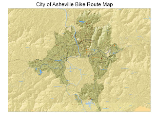
Just saw the email that we're supposed to post our maps. Here's mine so far. I still need to annotate and edit labels, but I think the colors and scale are pretty much done. I've been working on this at home alot and find a few differences between the 9.2 I have on my lap top and 9.3 at school. Wish I had more time to use the lab during the day--I'm up really early for work and my brain doesn't work so well at night. When I work on projects at home, I'm about 100 times more productive than I am at 9:00 at night in lab. For some reason, I can't seem to pull it together and since I'm tired, I just get angry and frustrated. Anyway, here it is--still a work in progress. One question I'd like some input from class: what size font should we use with such a large format map? I haven't done a test print yet, but would like to get the fonts down before I do it. Any suggestions?
10 comments:
So far, so good. Nice, clean, simple. Will look better as you add legend, etc. I used a font of bold 72 on my title. Concentrate on bike data.
That looks very good. The hillshade is beautiful.
I also still have a long ways to go. I like where you are headed. Background colors look good, should allow you to make bike routes 'pop'.
I like the earthy color scheme on this, looks very nice.
Looks good to me. Your information stands out nicely.
I agree with you. I also like your map.
Absolutely lovely coloring. Perhaps too much empahsis on waterbodies.
Hi,
My name is Kent. I'm a student in Taiwan, sadly I'm taking this course in Chinese so it'll be 100% self teaching for me.
I was wondering which textbooks your course uses now, and which did it use back then?
Post a Comment